
PrismaX brand assets.
The logo, the colors and the typefaces, with the few rules that go with them. For press, partners and anyone publishing about PrismaX.
Use the file. Don't redraw it.
The wordmark is black on light surfaces and cream on dark. Reach for the SVG first — the PNGs are there for contexts that can't take vector.

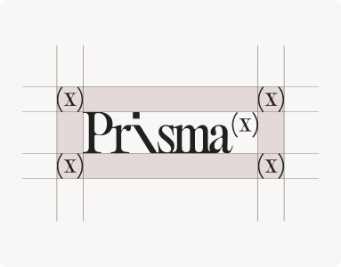
Keep clear space on all four sides equal to the height of the (X). Nothing else sits inside it.
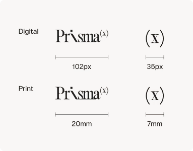
Never place the wordmark below 24px tall on screen, or 0.5in in print. Below that, use the monogram.
Warm ground, rationed accent.
Cream and near-black carry the brand; gold and bronze are accents, never fills. Click a swatch to copy its hex.
A serif for headlines, a sans for everything else.
Both faces are commercially licensed, so they aren't distributed here. If you're producing something for PrismaX and need them, get in touch.
Headlines and display figures. Set light — weight 200, never heavier than 300 — large, and tightly tracked.
0123456789
Body copy, navigation, buttons and labels. Weight 350 for long-form reading, 400 for body, 500 for labels.
0123456789
What you can do with these.
You're welcome to use the assets on this page to refer to PrismaX — in an article, a deck, an integration page or a partner listing. Everything below is the short version of the rules.
- Use the unmodified files from this page
- Write the name as PrismaX in copy — one word, no parentheses
- Give the logo its clear space, at 24px or larger
- Pick the black or light version for contrast against your background
- Redraw, retype or generate a version of the wordmark
- Recolor, stretch, rotate or add effects to it
- Use it in a way that implies partnership or endorsement we haven't agreed
- Make it part of your own logo, product name or domain
Not sure? Ask us first.
For press inquiries, co-marketing, or a use that isn't covered above, reach the team and we'll come back to you.